
🔗 User power, not power users: htop and its design philosophy
What the principles that underlie the software you make?
This short story is not really about htop, or about the feature request that I’ll use as an illustration, but about what are the core principles that drive the development of a bit of software, down to every last detail. And by “core principles” I really mean it.
When we develop software, we have to make a million decisions. We’re often driven by some unspoken general principles, ranging from our personal aesthetics on the external visuals, to our sense of what makes a good UX in the product behavior, to things such as “where does bloat cross the line” in the engineering internals. In FOSS, we’re often wearing all these hats at the same time.
We don’t always have it clear in our mind what drives those principles, we often “just know”. There’s no better opportunity to assess those principles than when user feedback asks for a change in the behavior. And there’s no better way to explain to yourself why the change “feels wrong” than to put those principles in writing.
Today was one such opportunity.
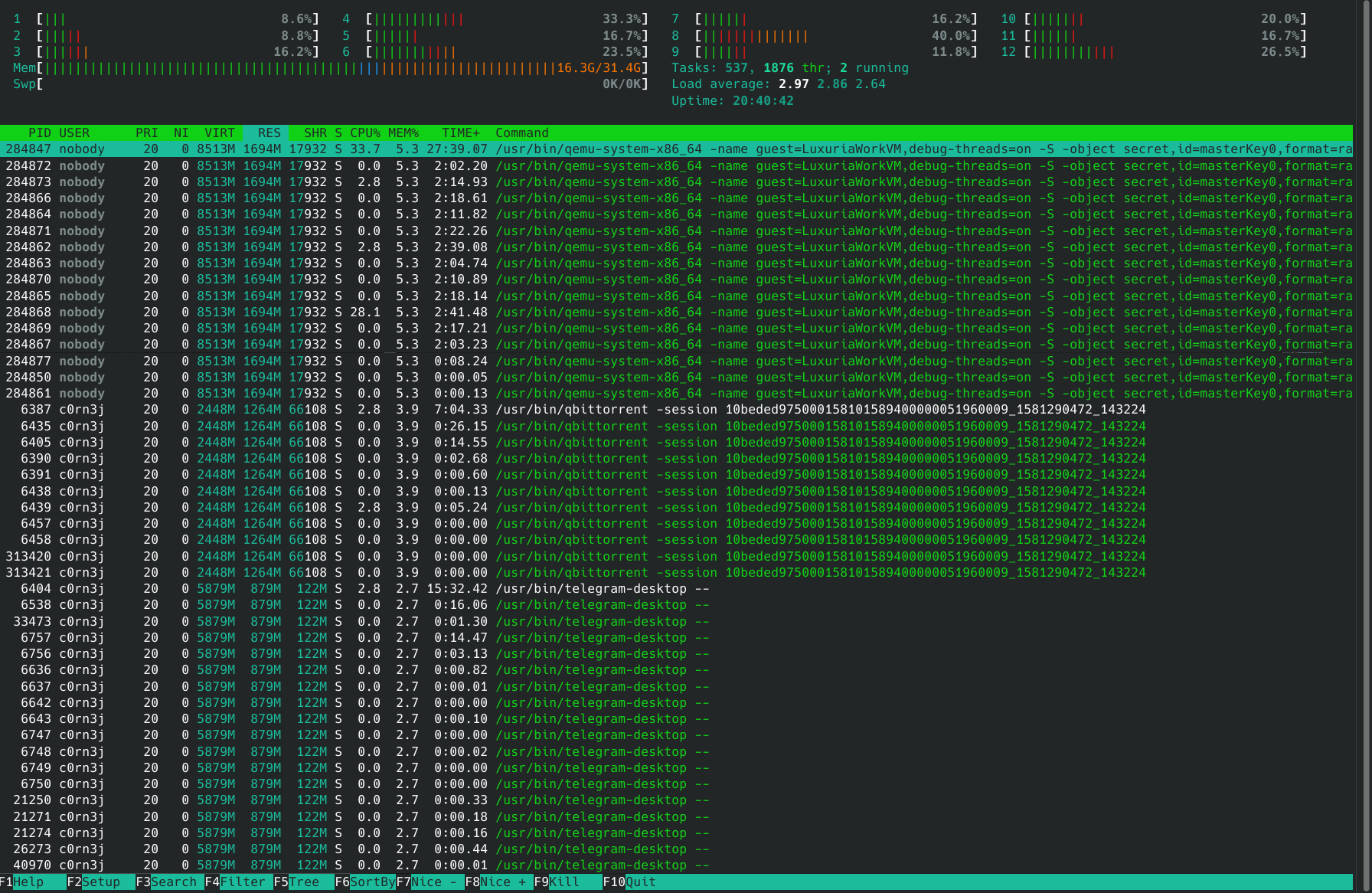
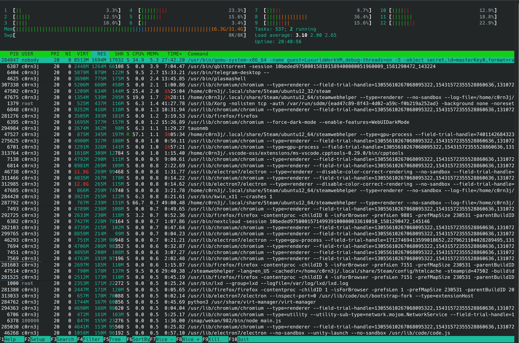
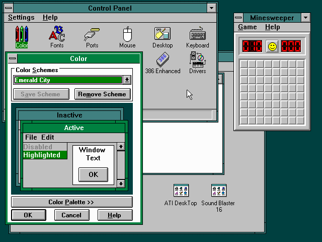
I was peeking at the htop issue tracker as an end-user, which is a refreshing experience, having recently retired from this FOSS project I started. I spotted a feature request, asking for a change to make it hide threads by default.
The rationale was sensible:
People casually using htop usually have no idea what userland threads are for.
People who actually need to see them can easily enable them via SHIFT+H.With them currently enabled by default, it is very inconvenient to go through the list and see what is running, taking up RAM, CPU usage and whatnot, therefore I think it’d be more user-friendly to not show them by default.
He proceeded to show two screenshots: one with the default behavior, full of threads (in green) mixed with the processes, and another with threads disabled.
When one of the current developers said that it’s easier for the user to figure out how to hide things than for them to discover that something hidden can be shown, the counter-argument was also sensible:
Htop can also show Disk IO, which can be arguably very useful, but is hidden by default.
At that point, I decided to put my “original author” hat on to explain what was the intent behind the existing behavior. Here’s what I wrote:
Hi @C0rn3j, I thought I’d drop by and give a bit of historical background as to what was my motivation for showing threads by default.
People casually using htop usually have no idea what userland threads are for.
Yes! I fully sympathize with this sentiment. And the choice for enabling threads and painting them green was deliberate.
You have no idea how many times I was asked “hey, why are some processes green?” over these 15+ years — and no, it wasn’t annoying: each of these times it was an opportunity to teach someone about threads!

htop was designed to provide a view to what’s going on in the system. If a process is spawning threads like crazy, or if all your cores are overwhelmed because multiple threads of a process are doing work, I think it’s fair to show it to the user, even if they don’t know a thing about threads — or I would say, especially if they don’t know a thing about threads, otherwise these things would be happening and they wouldn’t even know where to look.
Htop can also show Disk IO, which can be arguably very useful, but is hidden by default.
One of my last projects when I was still active in htop development was to add tabs to the interface, so that the user would have a more discoverable path for navigating through these additional columns:

This code is in the next branch of the old repo https://github.com/hishamhm/htop/ — I think the code for tabs is actually finished (though not super tested); it’s pretty nice, you can click on them or cycle with the Tab key, but the Perf Counters support which I was working on, never really got stable to a point of my liking, and that’s when I got busy with other things and drifted away from development — turns out I enjoy writing interface code a lot more than the systems monitoring part!
Anyway, I think that also illustrates the pattern that went into the design: I implemented the entire tabs feature because I wanted to make IO and Perf Counters more discoverable. I wanted to put that information in front of users faces, especially for users who don’t know about these things! I considered the fact that I had implemented the entire functionality of iotop inside htop but people didn’t know about it to be a personal failure, and a practical learning experience: adding systems functionality is useless if the UI design doesn’t get it to users’ hands. (And even I didn’t use the IO features because there was no convenient way of using them.)
I never wanted to implement a tool for “super advanced Linux power users who know what they doing”, otherwise I would have never spent a full line at the bottom showing F-keys, and I would have spent my time implementing Vim bindings (ugh ;) ) instead of mouse support. I’ve always made a point that every setting can be settable via the Setup screen, which you can access via F2-Setup (shown at the bottom line!) and which you can control with the keyboard or mouse, no “edit this config file to use this advanced feature for the initiated only” or even “read the man page” (in fact it only has a man page because Debian developers contributed it!).
I wanted to make a tool that has the power but doesn’t hide it from users, and instead invites users into becoming more powerful. A tool that reaches out its hand and guides them along the way, helping users to educate themselves about what’s happening on the internals of their system, and in this way have more control of it. This is how you hand power to users, not by erecting barriers of initiation or by giving them the bare minimum they need. I reject this dicothomy between “complicated tools for power users” and “stripped-down tools for mere mortals”, the latter being a design paradigm made popular by certain companies and unfortunately copied by so many OSS GUI projects, without realizing what the goals of that paradigm really were, but that’s another rant.
And that’s why threads are enabled by default, and colored in green!
(PS: and to put the point to the proof, I must say that the tabs feature was a much bigger code change than Perf Counters themselves; it included some quite big internal refactors (there’s no “toolkit”, everything is drawn “by hand” by htop) with unfortunately might make it difficult to ressurect that code (or not! who knows?), and of course tabs are user-definable and user-editable!)
The user who proposed the change in the defaults thanked me for the history tidbits and closed the feature request. But in some sense writing this down was probably more enlightening to me than it was for them.
When I started writing htop, I did not set out to create “an instrument for user empowerment” or any such lofty goal. (All I wanted was to have a top that scrolled and was more forgiving with mistypes than circa-2005 top!) But as I proceeded to write the software, every small decision had to come from somewhere, even if done without much deliberate thought, even if at the time it was just “it felt right”. That’s how your principles start to percolate into the project.
Over time, the picture I described in that reply above became clear to me. It helped me build practical guidelines, such as “every setting must be UI-accessible”, it helped me prioritize or even reject feature requests based on how much they aligned to those principles, and it helped me build a sense of purpose for the software I was working on.
If you don’t have it clear to yourself what are the principles that are foundational to the software you’re building, I recommend you to give this exercise a try — try to explain why the things in the software are the way they are. There are always principles, even if they are not conscious to you at the moment.
(PS: It would be awesome if some enterprising soul would dig down the tab support code and ressurrect it for htop 3! I don’t plan to do so myself any time soon, but all the necessary bits and pieces are there!)
🔗 Smart tech — smart for whom?
Earlier today I quipped on social media: “We need dumb tech and smart users, and not the other way around”.
Later, I clarified that I’m not calling users of “smart” devices dumb. People are smart. The tech should try to not “dumb them down” by acting condescendingly, cutting down on their agency and limiting their opportunities of education.
A few people shared replies to the effect that they wish for smart devices that wouldn’t be at odds with the intents of the user. After all, we all want the convenience of tech, so why settle for “dumb tech”, right?
The question here becomes a game of words: what is a “smart device”, after all?
A technically-minded person will would look at smart devices like smartphones, smart TVs, etc., and say “well, they are really computers”, or “they have computers inside”. But if we want to be technically pedantic, what is a computer? Having a Turing-complete microprocessor running programs? My old trusty microwave for sure has a microprocessor, but it’s definitely not a “smart device”. So it’s not about the internals, it definitely has to do with the end-user perception of the device.
The next reasonable approximation towards a definition is that a smart device allows you to install “apps”. You can extend it with more functionality (which is really making use of the fact that it’s a “computer inside”). Smart TVs and smart phones check this box. However, other home appliances like “smart kettles” don’t, the “smartness” comes from being internet-connected. So, generally, it looks like smart devices are things you either run apps in, or control via apps (from another smart device, of course).
So, allowing for running apps pretty much makes something into a computer, right? After all, a computer is a machine for running software. But it’s really interesting to think what is in fact a computer — where do we draw the line. From an end-user perspective, a game console is also a machine for running software — a particular kind of software, games — but it is not a computer. Is a Smart TV a computer? You can install apps in it. But they are also generally restricted to a certain kind of software: streaming services, video and the like.
Something doesn’t feel like a computer unless you can run any kind of software in it. This universality is a key concept. It’s interesting how we’re slowly driven back to the most fundamental definition of a computer, Alan Turing’s definition of a computer as a universal machine. Back in 1936, before the first actual computer was built during World War II, Turing wrote a philosophy section within a mathematics paper where he made this thought exercise of what it means to compute, and in his example he used the idea of a person doing the computations by hand: reading data, applying rules to process data, producing new data, repeat. Everything that computes follows this model: game consoles, the autopilot in an airplane, PCs, the microcontroller in my microwave. And though Turing had a technical notion of universality in mind, the key point for us here is that in our end-user understanding of a computer and what makes us call some things computers and others not, is that the program (or set of allowed programs) is not fixed, and this is what we see (and Turing saw) as universal: that any program that may be expressed in the computer’s language can be written and run on it, not just a finite set.
Are smart devices universal machines, then, in either sense of the word? Well, you can install new apps in them. Then, it can do new things it couldn’t yesterday. Does that make it a computer? What about game consoles? If I buy a new game (which is effectively new software!), it can also do new things, but you won’t really look at it as a computer. The reason is because you’re restricted on the kind of new software you can make this machine run: it only takes games, it’s not universal, at least from an end-user point of view.
But game consoles are getting “smarter” nowadays! They not only play games; maybe it will also have an app for showing you the weather, maybe it will accept some streaming service… but not others — and here we’re hinting at a key point of what “smart” devices are really like. They are, in fact, on the inside, universal machines that satisfy Turing’s definition. But they are not universal machines for you, the owner. For me, my Nintendo Switch is just a game console. For Nintendo, it is a computer: they can install any kind of software in it in their next software update. They can decide that it can play games, and also access Youtube, but not Netflix. Or they could change their mind tomorrow. From Nintendo’s perspective, the Switch is a universal machine, but not from mine.
The same thing happens, for example, with an iPhone. For Apple, it is a computer: they can run anything on it, the possibilities are endless. From the user’s perspective, it is a phone, into which you can install apps, and in fact choose from a zillion apps in the App Store. But the the possibilities, vast as they may be, are not endless. And that vastness doesn’t help much. From a user perspective, it doesn’t matter how many things you can do with something; what matters are what things you want to do with it, which of those you can and which ones you can’t. Apple still decrees what’s allowed and what isn’t in the App Store, and will also run their own software on the operating system, over which you have zero say. A Chromecast may also be a computer on the inside, with all the necessary networking and video capabilities, but Google has decided that it won’t let me easily play my movies with it, and so it can’t, just like that.
And such is the reality of smart devices. My Samsung TV is my TV, but it is Samsung’s computer. My house is filled, more and more, with computers over which I have no control. And they have control over what I can and what I can’t do with the devices I bought. From planned obsolescence, to collecting data on my habits and selling it, to complicating access to functionality that is there — the common thread in smart devices is that there is someone on the other side controlling the experience. And as we progress towards the “ever smarter”, with AI-based voice assistants being added to more devices, a significant part of that experience becomes the ways it “delights and surprises you“, or, in other words, your lack of control of it.
After all, if it wasn’t surprising, if it did just what you expected and nothing more, it wouldn’t be all that “smart”, right? If you take all the “smartness” away, what remains is a “dumb” device, an empty shell, waiting for you to tell it what to do. Press a button to do the thing, and the thing happens. Don’t press, it doesn’t do the thing. Install new functionality, the new functionality is installed. Schedule it to do the thing, it does when scheduled, like a boring old alarm clock. Use it today, it runs today. Put it away, pick it up to use it ten years from now, it runs ten years from now. No surprise upgrades. No surprises.
“But what about the security upgrades”, you ask? Well, maybe I just wanted to vacuum my living room. Can’t we design devices such that the “online” component isn’t an indispensable, always-on necessity? Of course we can. But then my devices wouldn’t be their computers anymore.
And why do they want our devices to be their computers? It’s not to run their software in it and free-ride on our electricity bill — all these companies more enough computers of their own than we can imagine. It’s about controlling our experience. Once the user has control over which software runs, they make the choices. Once they don’t, the choice is made for them. Whenever behavior that used to be user-controlled becomes automatic in a “smart” (i.e., not explicitly user-dictated) way, that is a way where a choice is taken away from you and driven by someone else. And they might hide choices behind “it was the algorithm”, which gives a semblance of impersonality and deniability, but putting the algorithm in place is a deliberate act.
Taking power away from the user is a deliberate act. Take social networks, for example. You choose who to follow to curate your timeline, but then they say “no, we want our algorithm to choose who to display in your timeline!”. Of course, this is always to “delight” you with a “better experience”; in the case of social networks, a more addictive one, in the name of user engagement. And with the lines between tech conglomerates and smart devices being more and more blurred, the effect is such that this control extends into our lives beyond the glass screens.
In the past, any kind of rant like this about the harmful aspects of any piece of tech could well be responded with a “just don’t use it, then!” In the world of smart devices, the problem is that this is becoming less of an option, as the fabric of our social and professional lives increasingly depends on these networks, and soon enough alternatives will not available. We are still “delighted” by the process, but just like, 15 years in, a smartphone is now just a phone, soon enough a smart kettle will be just a kettle, a smart vacuum will be just a vacuum and we won’t be able to clean our houses unless Amazon says it’s alright to do so. We need to build an alternative future, because I don’t want to go back to using a broom.

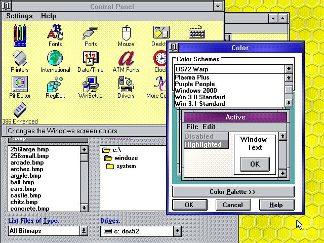
🔗 Remembering Windows 3.1 themes and user empowerment
This reminiscence started reading a tweet that said:
Unpopular opinion: dark modes are overhyped
Windows 3.1 allowed you to change all system colors to your liking. Linux been fully themeable since the 90s. OSX came along with a draconian “all blue aqua, and maybe a hint of gray”.
People accepted it because frankly it looked better than anything else at the time (a ton of Linux themes were bad OSX replicas). But it was a very “Ford Model T is available in any color as long as it’s black” thing.
The rise of OSX (remember, when it came along Apple had a single-digit slice of the computer market) meant that people eventually got used to the idea of a life with no desktop personalization. Nowadays most people don’t even change their wallpapers anymore.
In the old days of Windows 3.1, it was common to walk into an office and see each person’s desktop colors, fonts and wallpapers tuned to their personalities, just like their physical desk, with one’s family portrait or plants.
 |
 |
|
I just showed the above screenshots to my sister, and she sighed with a happy nostalgia:
— Remember changing colors on the computer?
— Oh yes! we would spend hours having fun on that!
— Everyone’s was different, right?
— Yes! I’d even change it according to my mood.
Looking back, I feel like this trend of less aesthetic configurability has diminished the sense of user ownership from the computer experience, part of the general trend of the death of “personal computing”.
I almost wrote that a phone UI allows for more self-expression today than a Win/Mac computer. But then I realized how much I struggled to get my Android UI the way I wanted, until I installed Nova Launcher that gave me Linux-levels of tweaking. The average user does not do this.
But at least they are more likely to change wallpaper in their phones than their computers. Nowadays you walk into an office and all computers look the same.
The same thing happened to the web, as we compare the diminishing tweakability of a MySpace page to the blue conformity a Facebook page, for example.
Conformity and death of self-expression are the norm, all under the guise of “consistency”.
User avatars forced into circles.
App icons in phones forced into the same shape.
Years ago, a friend joked that the inconsistency of the various Linux UI toolkits was how he felt the system’s “freedom”. We all laughed and wished for a more consistent UI, of course. But that discourse on consistency was quickly coopted to remove users’ agency.
What begins with aesthetics and the sense of self-expression, continues to a lack of ownership of the computing experience and ends in the passive acceptance of systems we don’t control.
Changes happen, but those are independent from the users’ wishes, and it’s a lottery whether the changes are for better or for worse.
Ever notice how version changes are called “updates” and not “upgrades” anymore?
In that regard, I think Dark Mode is a welcome addition as it allows a tiny bit of control and self-expression to the user, but it’s still kinda sad to see how far we regressed overall.
The hype around it, and how excited users get when they get such crumbles of configurability handed to them, just comes to show how users are unused to getting any degree of control back in their hands.
🔗 When listing repeated things, make pyramids
Often, in code, we have to write lists of repeated things. For example, attribute initialization in Java constructors:
this.foo = foo;
or required modules in Lua:
local foo = require("foo")
There are a few different ways people stack these when they need to list a number of them: randomly, alphabetic, aligned… working on a codebase that has all these approaches in different modules, I realized that “pyramid” is best. Let’s compare a few examples:
Random
This is what you end up doing if you don’t really think about it:
this.medium = medium;
this.aLongOne = aLongOne;
this.foo = foo;
this.veryLongOne = veryLongOne;
this.short = short;
⊖ ⊖ very bad to read - your eyes move back and forth horizontally and need to scan the whole thing vertically
⊕ easy to maintain - just add or remove entries arbitrarily
Alphabetical
This is what you end up doing if you get annoyed about the order when writing. I did this for a while.
this.aLongOne = aLongOne;
this.foo = foo;
this.medium = medium;
this.short = short;
this.veryLongOne = veryLongOne;
⊖ bad to read - your eyes move back and forth horizontally, but it’s easy to scan vertically
⊕ easy to maintain - no question where a new entry should go
Aligned
This is what you end up doing if you start to get annoyed when reading. Readability is more important than writability, after all!
this.aLongOne    = aLongOne;
this.foo         = foo;
this.medium      = medium;
this.short       = short;
this.veryLongOne = veryLongOne;
⊕ ⊕ very easy to read easy on the eyes horizontally, and if alphabetical it’s easy vertically as well
⊖ ⊖ very bad to maintain terrible for diffs, changes mess up `git blame` for unrelated lines
Pyramid
Finally, we get to the pyramid, which seems an ideal compromise keeping the advantages of an aligned list while avoiding its drawbacks:
this.veryLongOne = veryLongOne;
this.aLongOne = aLongOne;
this.medium = medium;
this.short = short;
this.foo = foo;
⊕ easy to read - easy on the eyes horizontally as the eyes follow the diagonal, and easy vertically as well as you usually know if you’re looking for a long or short word
⊕ easy to maintain - no question where entries go; you can use alphabetical order as a tie breaker for entries of same length
You can of course do the pyramid “ascending” or “descending”. I don’t really have a preference (and I couldn’t find any practical advantages to either yet).
In conclusion, it’s a silly little thing, but something that improves the ergonomics of the code and which I’ll try to adopt in my code more consistently from now on.
(PS: Of course, all of this applies to lists where the entries are not semantically related: when listing color components one would always do “red, green, blue”, and not “green, blue, red” :) )
🔗 What Every Programmer Needs To Know About What Every Programmer Needs To Know
I won’t deny it. I came up with the title for this post before coming up with the actual content. It came to my head and it was just too good to pass, because it entices you to think about that subject. What does every programmer need to know, after all?
-
What Every Computer Scientist Should Know About Floating-Point Arithmetic - What Every Programmer Should Know About Memory
- What every computer science major should know
- What every programmer absolutely, positively needs to know about encodings and character sets to work with text
- The Absolute Minimum Every Software Developer Absolutely, Positively Must Know About Unicode and Character Sets (No Excuses!)
- What Every Programmer Needs To Know About Game Networking
- What every programmer should know about time (the blog post is simply called “Time”, but it was featured in Hacker News with the long title)
What every programmer should know about names (actually titled “Falsehoods Programmers Believe About Names” — this is about people’s names)
If you run into any other of those lists, let me know at h@ this website’s domain!
Follow
🐘 Mastodon ▪ RSS (English), RSS (português), RSS (todos / all)
Last 10 entries
- Aniversário do Hisham 2025
- The aesthetics of color palettes
- Western civilization
- Why I no longer say "conservative" when I mean "cautious"
- Sorting "git branch" with most recent branches last
- Frustrating Software
- What every programmer should know about what every programmer should know
- A degradação da web em tempos de IA não é acidental
- There are two very different things called "package managers"
- Last day at Kong